Upped Events

Chat Communication Feature Design

(Desktop)

Chat Communication Feature Duration: 1 month Tools: Figma

The Project

Upped Events is a new event management platform with the purpose of serving all the needs of the event owners and event attendees. I am one of the UX designers and I meet with the product owner frequently to discuss requirements for the feature and to go over ideas and make changes until we meet the user’s needs.

Communication in the workspace is key to deliver excellent service to both team members and customers. I was tasked to create a communication feature for Upped Events in which the event owner could communicate with everyone within the platform and vice versa.

The problem

There is no way to communicate within the platform.

The need

The event owner needs to be able to communicate with the their staff, wether it is for scheduling questions or issues they may have with the platform.

Research

Competitor Analysis

I researched and looked at different methods of interaction within a platform. Aswell, as other chat features for inspiration.

Key Findings & Insight

A few of the needs included: Where the feature could be accessed from, how much space it could take up on a web browser screen or app and what options would it include.

On this page I came up with having the chat icon be accessible from the top right row of icons so that it was easier to locate. It didn’t really fit any of the sub menus.

Ideate


Mockups


I then sketched out some mid-fidelity mockups on Balsamiq to get an idea of the layout of the chat pop up.

Testing


Test


I was able to create a few hi-fidelity mockups through Figma and had design meetings where I met up with my design team and gathered their feedback. I also scheduled meetings with my design lead regularly to run ideas as well as get his perspective on how the project was coming along.

Examples of some final screens

Opening the chat pop-up from clicking the chat icon on the top of the screen. The icon to the right of the search icon. These four pages demonstrate the stages of minimizing and maximizing the chat pop-up.

These next screen demonstrate the notification alert when new messages are sent. It is displayed by the red dot above the chat icon or red icon above the profile picture icon. It contains the number of messages that that haven’t been read.

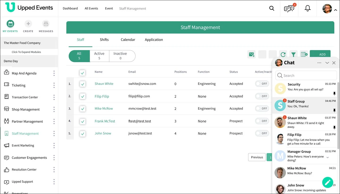
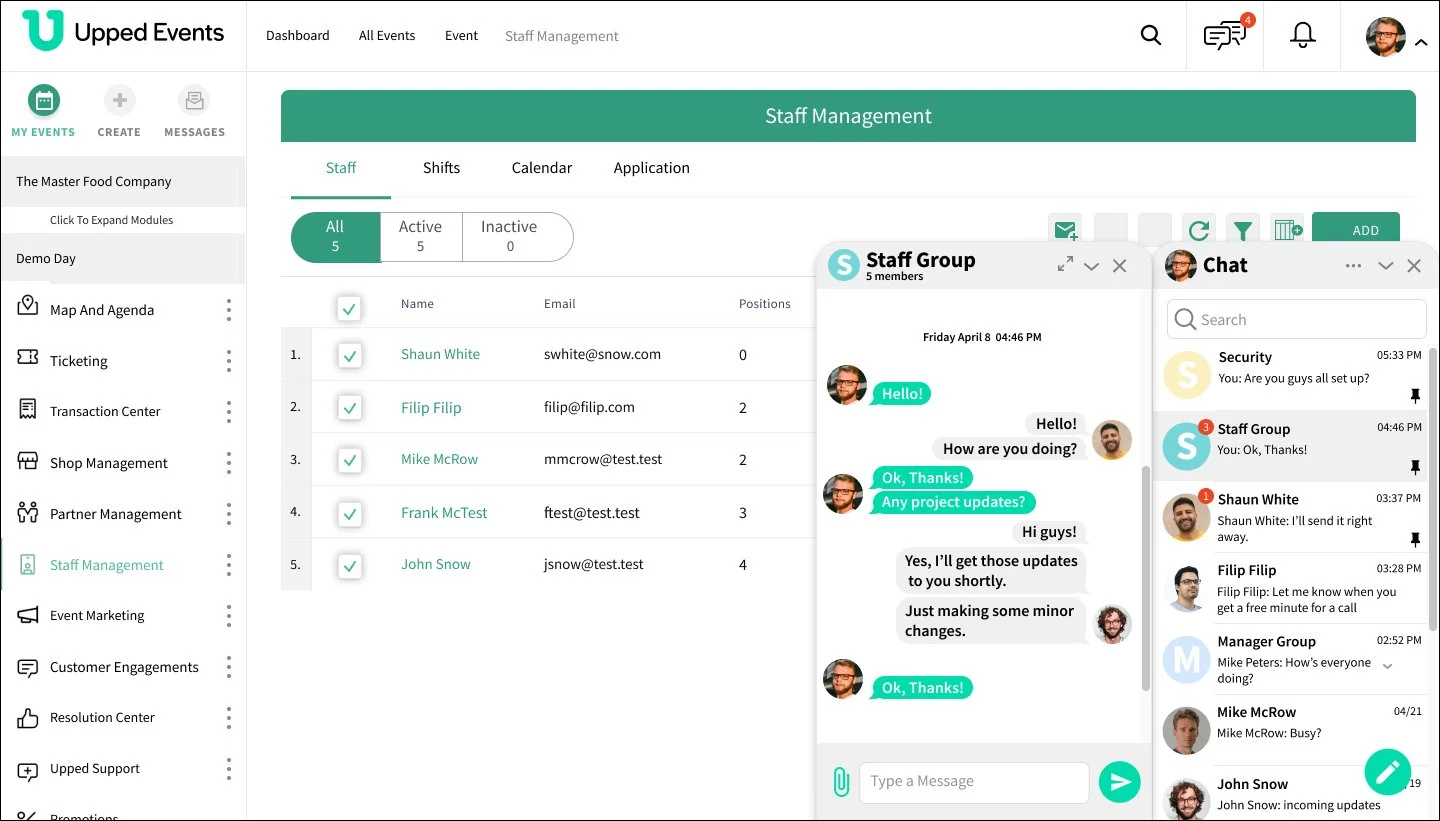
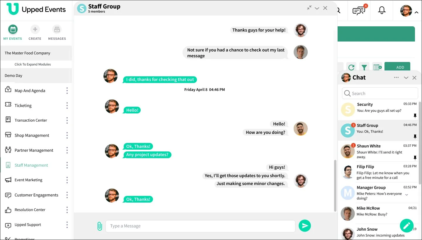
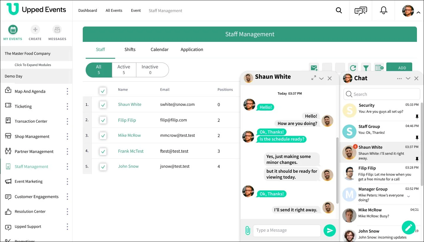
These next screens shows the pop-up screen that show up when one of the messages are clicked to view conversation. In this case the person “Shaun White” has responded and his last message is seen in the chat screen. The pop-up open ups to the left of the chat. I designed it it to open from the right-bottom of the screen since it was the are of least importance to be able to see the main page. That way the chat can be opened while performing other tasks.

Conclusion


This project was a great way of testing my skills as a designer and utilizing what I learned so far. By no means is this finalized. Some of the prototyping needs to run smoother. I also forgot to incorporate some other ideas I never finished. Some challenges I came across were iconography sizing and the navigation back to certain lists.